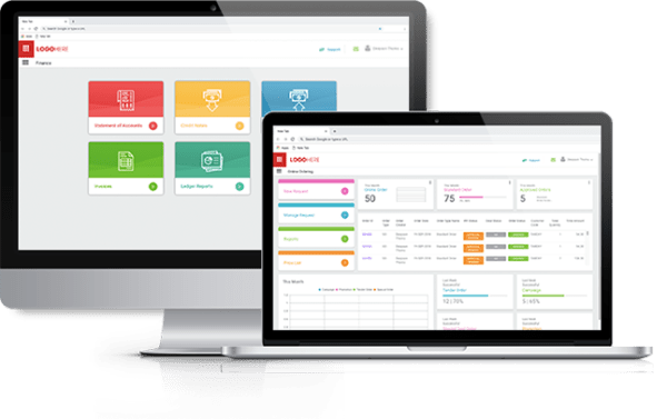
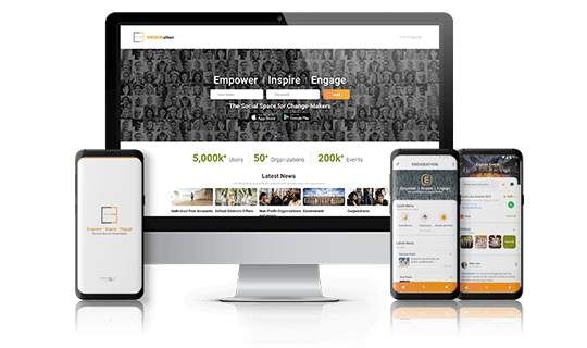
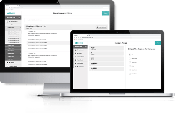
A customer facing application or a website is much more than a group of connected screens. It’s an interface, a space where functionality meets user experience. The interaction creates an experience for the user, and as an app designer, it’s your job to ensure that experience is as good as it can possibly be. In this writeup, I will list a few simple techniques to enhance user experience while doing an App Design.
Firstly, what is app design?
It is the process of communicating with the user through beautiful architecture (UI & UX) which involves Idea, Spec, Wireframe, prototype, Visual design etc.
Is Application Design a creative job? Can anyone design an app?
Well, I believe designers have a big role to play in attractiveness and aesthetics. Creativity accounts for 30% of a designer’s profile. Another 50% can be acquired from experience and references. Component guides such as Apple Design, Material Design, Microsoft UWP Design, IBM Design Kit, Adobe Experience Manager Core Components etc. are available which will give a fair idea about how to go about. The remaining 20% is what I’m intending to tell you through this blog.
Now for the main part of this write-up, the techniques…
This is by no means a complete list, but few tips which I found useful while designing an app.
Hick’s law
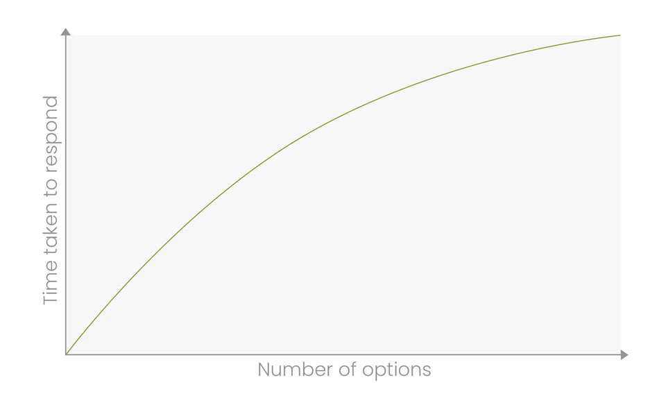
Hick’s Law states that Number of options is directly proportional to the time taken to respond. In other words, the more choices a user faces, the longer it will take to make a decision.
What can we learn from Hick’s law?
- Simplify choices for the user by breaking down complex tasks into smaller steps.
- Give simple direction to the new user without inciting confusion by giving them too many options.
- Categorizing the options within a navigation system (drop-down menu, filters, etc.)
- Reducing the number of choices instead of listing out every single product (Popular choices, Latest Choices, Offer Limited etc.)
Use Golden Ratio
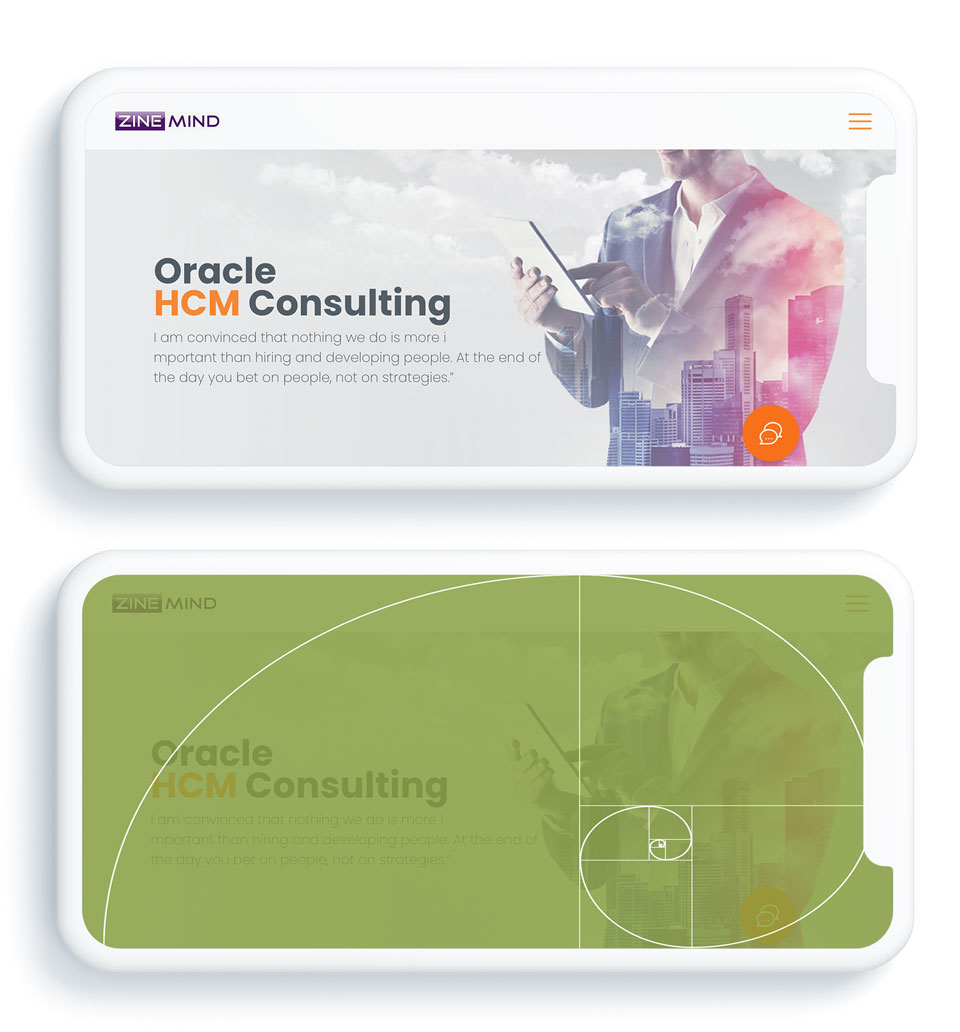
The golden ratio is a mathematical proportion between the elements of different sizes which is thought to be the most aesthetically pleasing for human eyes. The golden ratio is 1:1.618 and it can be used to create visually-pleasing, organic-looking compositions in your project.
F-layout
Users have the tendency to browse the screen in an “F” pattern.
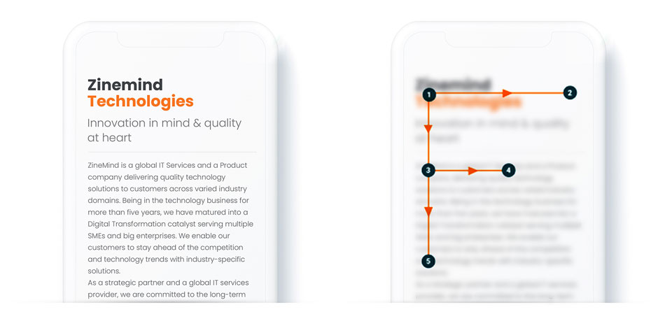
Typically, this is the way our eyes move when we read a content. The viewer’s eyes are likely to begin at the top left, across the top of the page to read important headlines. Next, they will move along the subheading or images. Then, they scan down vertically. Readability of a content depends upon the Font family, Size, Color, Letterspace, Line Height etc.
K.I.S.S. Manthra
“Keep it Simple, Stupid”. If you’re creating a page, Make it simple.
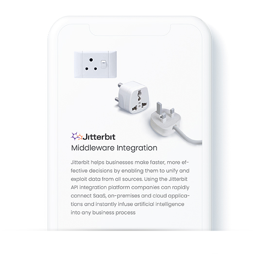
Try to make your interaction design short, crisp and straightforward. It will involve the user faster. So, try not to overcomplicate your designs.
Fitts’ law
Fitts’ law states that the amount of time required for a person to move a pointer (e.g., mouse cursor) to a target area is a function of the distance to the target divided by the size of the target.
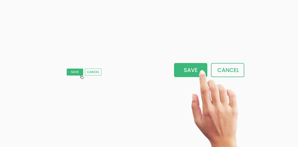
Fitts’ law is widely applied in user experience (UX) and user interface (UI) design. This law influenced the convention of making interactive buttons large (especially on finger-operated mobile devices) – smaller buttons are more difficult and time-consuming.
8 Second rule
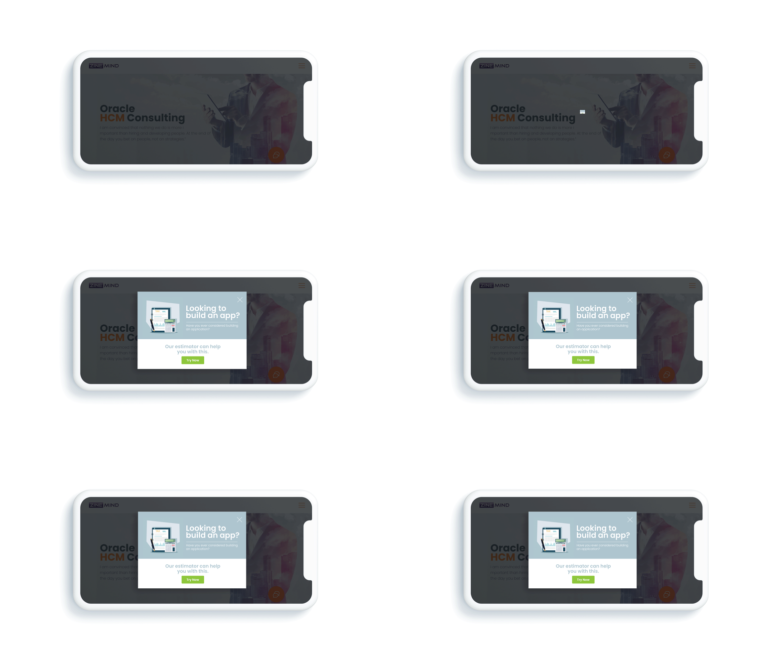
In the 8 second era, websites and applications need to engage the user every second of the experience. Making the user wait when they intend to perform an action is asking for them to get distracted.
A user looking for requirements wants to find them quickly. So, try to use eye-catching imagery that conveys the main point, make buttons large, powerful words, hover effects, gifs, images, animations etc.
Brands will embrace the technique to introduce micro interactions in their design process.
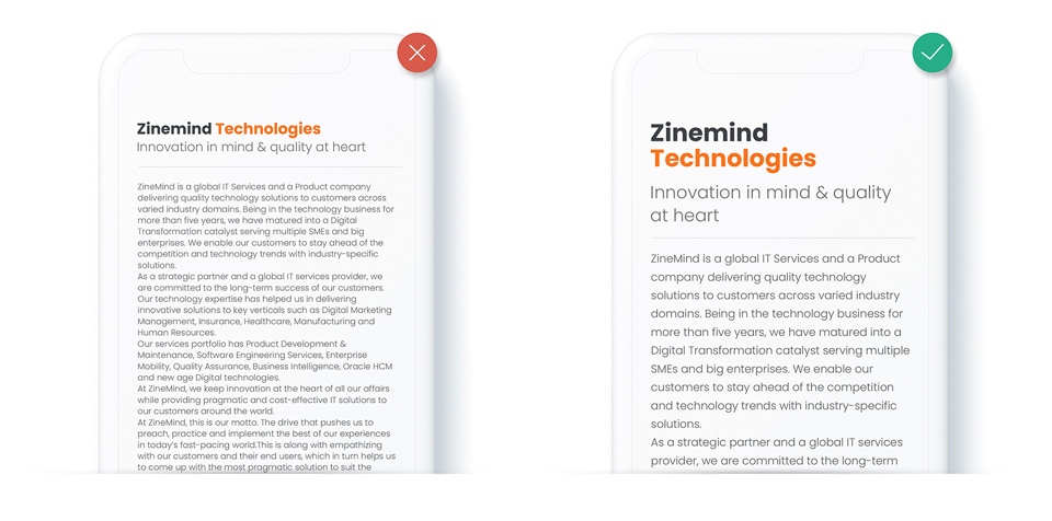
Pay attention to the text
Typography plays an important role in designing applications. Here I will briefly state some key factors to make your app appear easy on the eye.
Font Family, Text Size (Typically, the text should have a minimum size of at least 11 px without zooming), Font color, Font weight, Letter Spacing, Line Height, Limited fonts (Avoid using More than 2- 4 fonts), Hierarchy etc.
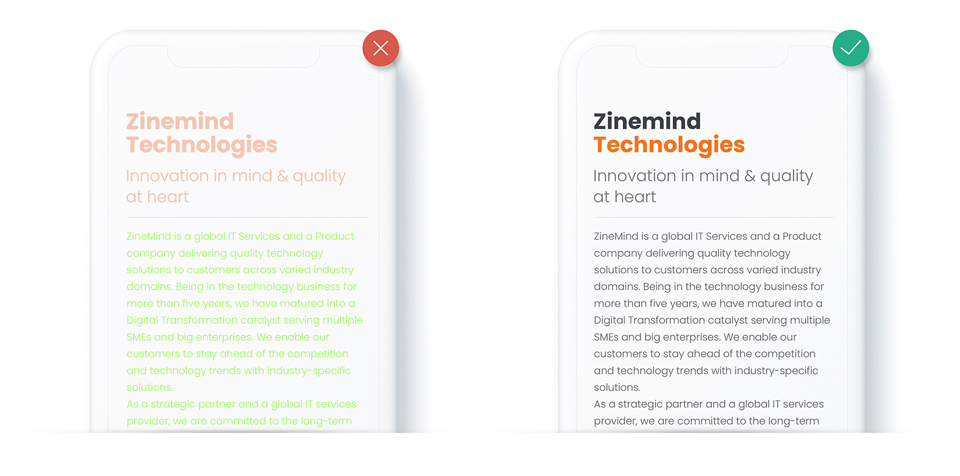
Color & Contrast
Color embodies the soul of a designer and contrast is one of the key factors that affects the readability and visual hierarchy of a design. It has the power to affect the mood of a user so it plays an important role in any design.
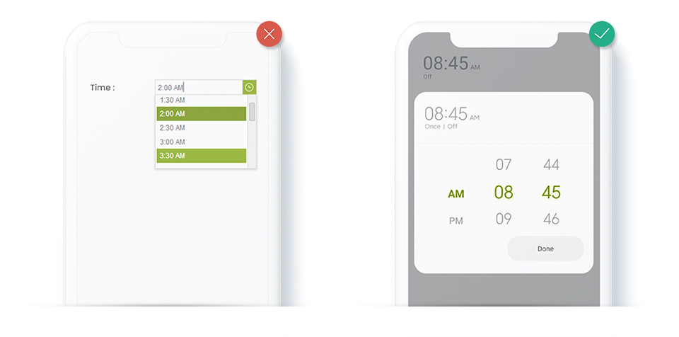
Touch controls
Touch controls are very intuitive to the user. Leverage such controls in touch enabled devices. Try to UI components which responds to general gestures such as tap, double-tap, drag, flick, pinch, spread, press, press and tap, press and drag, rotate, etc.
Hit Targets
The average user should have at least 44×44 Px with a finger space.

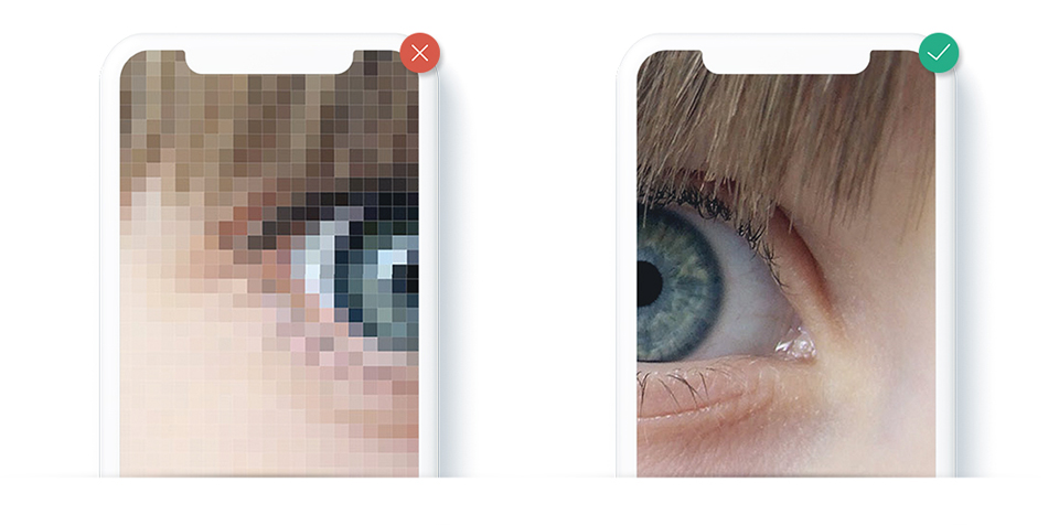
Use High-Quality Images & Resolution
Use high resolution web images.
Here some references
Pexels, StockSnap, Unsplash, Negative Space, Little Visuals, Picjumbo, Kaboompics
Avoid Image Distortion
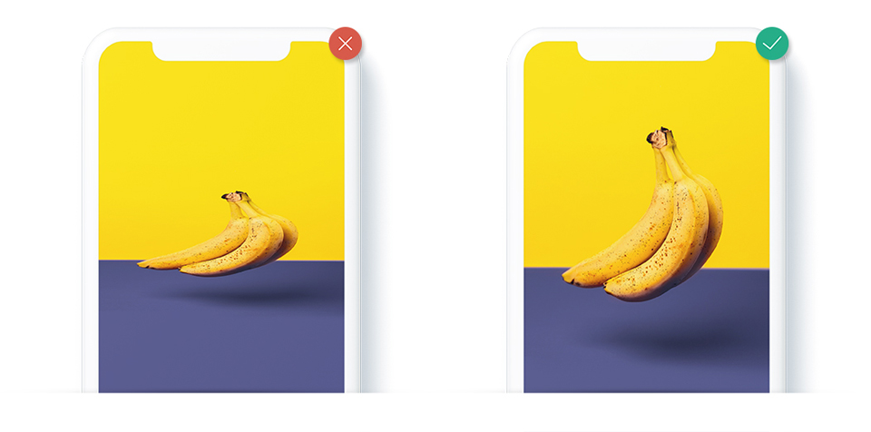
To avoid distortion, use the image in aspect ratio.
Visual Hierarchy
There is a specific visual hierarchy to keep in mind while designing an application. From a designer’s point of view, alignment (text alignment, horizontal alignment, center alignment, optical alignment etc.), organization and content formatting plays a crucial role when it comes to guiding a user.

Visual hierarchy explains
- What the user sees
- What the user scans
- What the user ignores
Like I mentioned earlier, not all the design tips are covered in this blog. These are just few basic tips which may help you while designing your app. The features on this blog are inferenced from my past experiences.
I’ll be bringing you more in-depth design how-tos in my future blogs in this space.

