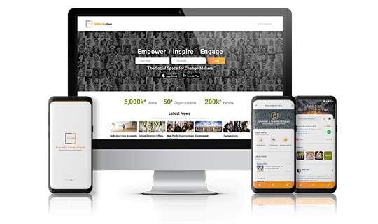
Brand identity is the essence of a brand, encompassing the tangible and intangible aspects that shape how consumers perceive it. It is what the brand wants to project – its personality, values, and mission. It’s an experience that resonates with users, leaving a lasting impression.
Visual Design is not just about making something aesthetically pleasing but also about evoking emotions. UI/UX design is the magic behind user-friendly products. UI (User Interface) design focuses on the visual elements and layout that users interact with, while UX (User Experience) design considers the entire user journey, ensuring the product is intuitive, efficient, and enjoyable to use.
The Role of UI/UX in Brand Identity
UI/UX design plays a crucial role as the invisible ambassador, shaping brand perception and fostering lasting connections.
• Translates brand identity into an interactive experience.
A minimalist interface with clean lines reflects a brand focused on efficiency, while playful animations might embody a brand’s youthful spirit. This visual consistency strengthens brand recognition and reinforces the intended brand image.
• Fosters user trust and builds brand loyalty.
Intuitive navigation, clear architecture, and a focus on user needs create a positive user experience. When users can easily achieve their goals and find the information they seek, they develop trust in the brand which translates into brand loyalty.
• Helps differentiate a brand in a crowded marketplace.
By prioritizing user needs and creating innovative functionalities, UI/UX design can elevate the user experience beyond the competition. This can be anything from a seamless checkout process to a personalized recommendation system.
Key Elements of Visual Design that Create a Strong Brand Identity
1. Consistency
By using the same logo, color palette, typography, and imagery across all touchpoints – website, packaging, and social media – your brand becomes easily recognizable. When elements with similar appearances have similar functions, users don’t need to relearn how to interact with each one. Many mobile apps use a swipe gesture for quick actions.
For example, swiping left might consistently delete an email, a photo, or a message across various app sections. This functional consistency creates a familiar user experience across different functionalities within the app.
2. Color Palette
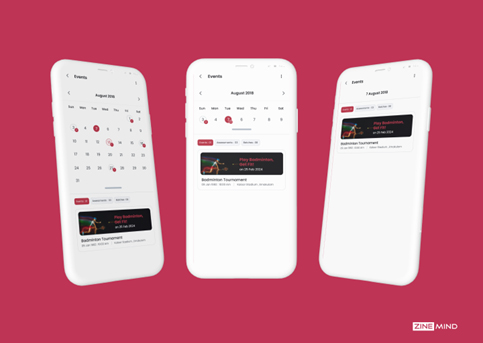
Colors can evoke specific emotions and moods, influencing how people feel about a brand. By carefully selecting colors that align with the desired emotional response, brands can create a deeper connection with their audience
3. Typography
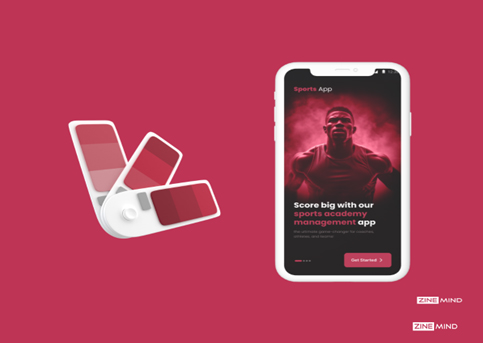
Choosing the right typeface aligns your visual identity with your brand’s core values and target audience. Here are a few primary constituents to keep in mind;
• Font choice: Select fonts that suit your content and audience and are easy to read on different screen sizes
• Weight & Size: Use bolder and larger fonts for headings and important information.
• Color & Contrast: Text color can influence mood and brand identity greatly. Always prioritize good contrast between text color and background.
• Letter Spacing & Line Height: Proper spacing between letters and lines prevents text from appearing cramped or difficult to follow.
4. Imagery and Icons
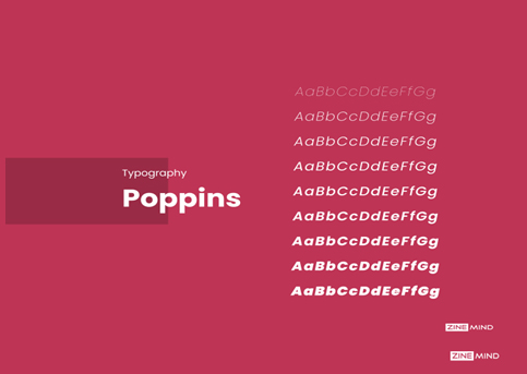
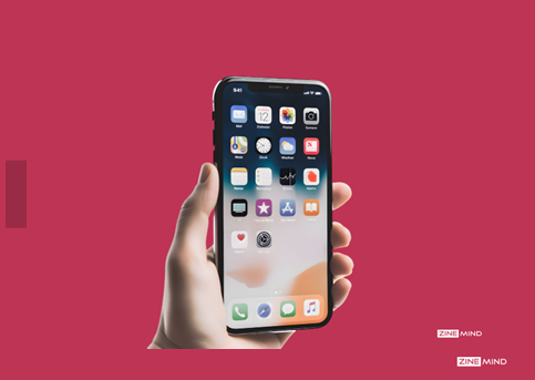
Imagery and icons are the visual storytellers of your brand identity. A picture is truly worth a thousand words, and strong visuals can convey complex messages in a way that text alone cannot. Consistent use of specific imagery and icons can become instantly recognizable. These recurring visual elements reinforce brand recognition and create a sense of familiarity with your audience.
5. Layout and Composition
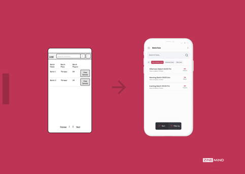
By strategically structuring your visual elements, you create a clear, balanced, and aesthetically pleasing brand experience that reinforces your message and strengthens your brand identity. A well-composed layout creates a sense of balance and harmony. This doesn’t necessarily mean everything needs to be symmetrical, but there should be a pleasing visual arrangement that avoids overwhelming the viewer.
How to Enhance UX through Visual Design
Visual design plays a critical role in enhancing user experience. Here are some key ways to achieve this:
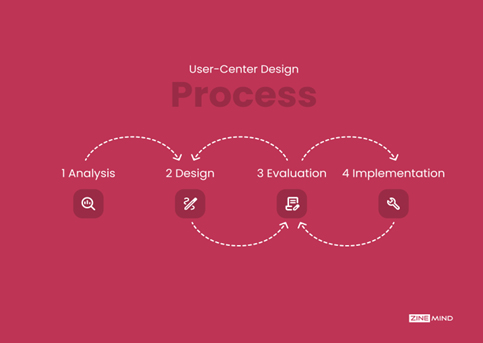
1. User-Centric Design
Start with user research, understanding your target audience’s needs and preferences. Your visual design should be intuitive and user-friendly. This includes clear navigation, easy-to-read text, and logical layout.
For example, you find out your audience prefers clean, minimalist interfaces. You can then design a website that reflects this preference, creating a user experience that feels familiar and comfortable, thereby fostering brand loyalty.
2. Interactive and Engaging Elements
By incorporating interactive and engaging elements, you can showcase your brand’s commitment to user experience and technological advancement.
a. Micro-interactions: Subtle animations or changes that occur on hover or click, adding a touch of delight to user interactions.
b. Interactive infographics: Infographics that allow users to explore data points or filter information.
c. Clickable prototypes: Interactive mock-ups that simulate user experience with a product or service.
d. Augmented reality (AR) experiences: Overlaying digital elements onto the real world for an immersive brand experience.
e. Intuitive navigation: Keeping navigation layouts simple and easy to scan. Users should be able to quickly understand the available options.
3. Responsive Design
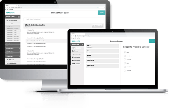
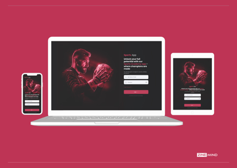
Responsive design ensures your website or app adapts seamlessly to different screen sizes and resolutions, from desktops to tablets and smartphones and optimizes content layout to minimize unnecessary scrolling which keeps users focused on your content and reduces the frustration of endless scrolling. It also enables faster loading times on mobile devices.
4. Accessibility
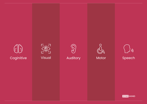
Ensure your visual design is inclusive and usable for everyone. Use plain language and avoid jargon to ensure information is easy to understand for users with cognitive disabilities.
Features like alt text descriptions for images, and keyboard navigation options make your product easier to use for everyone. This not only benefits users with disabilities but also caters to users with slower internet connections or who prefer using keyboards for navigation.
Success Stories!
Here are a couple of success stories where UI/UX design played a pivotal role in a brand’s success:
1. Airbnb: From Frustration to User-Friendly Delight
• The Challenge: In its early days, Airbnb’s website was cluttered and confusing. Booking a stay was a cumbersome process, leading to frustration for users and hindering growth.
• The UI/UX Fix: Airbnb completely revamped its website with a focus on intuitive navigation, clear search filters, and high-quality visuals showcasing properties. The booking process was streamlined, making it easier for users to find and book stays. Navigation elements were prioritized using size, color, and spacing. Important options like “Book” buttons were visually distinct for clear user guidance.
2. Dropbox: Simplifying Cloud Storage and User Adoption
• The Challenge: Dropbox, the cloud storage service, initially had a complex interface that limited user adoption. New users struggled to understand its functionalities and value proposition.
• The UI/UX Fix: Dropbox simplified its interface, focusing on clean visuals and a user-friendly drag-and-drop upload system. Tutorials and clear explanations within the platform helped users understand the benefits of cloud storage. They also introduced the now-iconic drag-and-drop upload system.
To Sum up
By translating brand values into an intuitive and user-centered experience, UI/UX design fosters trust, loyalty, and brand differentiation. By prioritizing these elements, you create a user experience that is inclusive, convenient, and enjoyable for everyone. This strengthens your brand image as one that values user-centricity and caters to a diverse audience.


